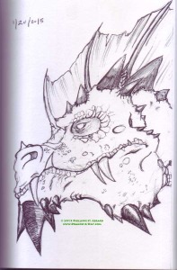
No process sketch tonight. In fact, probably around the same point from last night’s sketch, I was feeling like I couldn’t pull it off:
The muzzle’s a little too short on this one, but such is the way of the pen. Also, for the Red and Green dragons, I’ve been working from Todd Lockwood‘s “identifier” illustrations in Draconomicon for reference. There’s a lot of strange texturing in the face that’s not quite scales. It just looked strange when I tried to replicate it, so I had to improvise in places- the large swathes of “clear” face looked wrong (and make me want to redo the Blue dragon from last weekend), but I lacked the intestinal fortitude to cover the entire face with… roughage. Less is more.
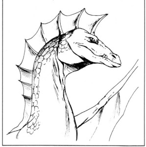
Also, working on this had me thinking about the drastic transitions that the Green dragon’s gone through in the various iterations. In D&D and AD&D, it looks smooth, suave even, though the sneer is still there, which fits with the catty, subtle personality they’re said to have:
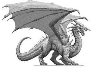
and in 4e, someone thought that this absurd nose horn was a distinctive silhouette, something about injecting poison or something (poison became a damage type, if I recall correctly):
And somewhere between the two, the design became kind of crusty. I mean, all the chromatics are like that, because they’re evil and are supposed to be grody-looking, but the green always struck me as especially crusty, and I’m not sure why.


