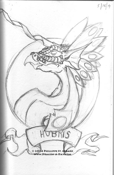
So, Pride:
I like where this is headed. Obviously, the horn needs to fit on the page, but the semi-regal posture (looking closely, the puffed-out chest is just a kink in the neck, as opposed to bulk), the actually skinny neck and even (to an extent) the craggy, almost aged look pull it together for me- the overall look and feel should be something like Pride lacks substance but has lots of flash.
And I actually like the layout better, probably because it’s simpler. I definitely enjoyed the idea of a propaganda-style design, but this seems to bring more attention to Pride itself, as opposed to having it compete with the rest of the page. I’m a bit torn.


