I did a teensy bit of messing around with shapes in Illustrator, but mostly got frustrated when I couldn’t draw a pentagram, so went back to sketching around for composition’s sake. The pentagrammy elements might take away too much from text space, so for now I’m shelving it.
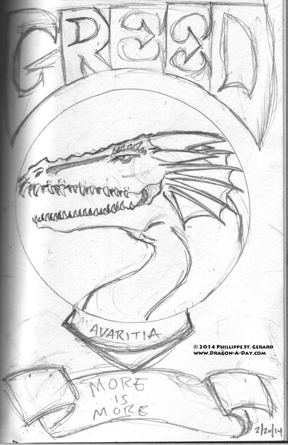
However, I did think of something not-quite-as-propaganda-y, but I like:
Adding the Latin name and putting the “motto” on a bit of scrollwork seemed like a good idea to me, and I’m digging it so far. I want to keep them all looking the same, composition-wise, but am now wondering if I can play with the details (and the Devil inside them) to have any elements reflect their individual personalities. Probably needs to be some sort of ring around that Porky Pig-style lenticular, so I can do thematic things with it, too…
And I still don’t have a clue what the text is going to look like; I feel like it’s going to end up as some kind of cross between a simple calligraphic font and some sort of black metal affair.
Finally, you may have noticed that Greed got a slight upgrade between December ’12 and now; more teeth and additional vanes in his fins (more of everything!) to dress him up a bit.


