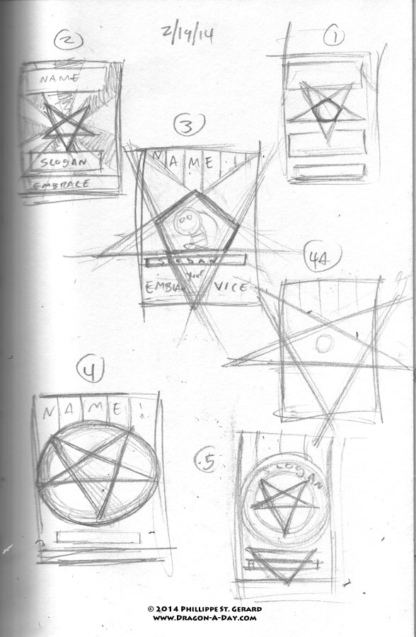
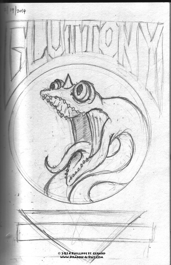
So I did a little sketching around and looking at propaganda posters in Google Images for inspiration, but haven’t made any hard decisions yet. I thought that design-type elements like type and negative space ought to play a stronger role in the overall shape, but other examples have shown that that’s not necessarily the case.
In fact, text seems to play a major role, and the only recurring element is the “sunburst” in more modern posters (that all seem to be for pop culture, so if they’re referencing themselves or each other, that’s not much of a surprise).
Anyhoo, I’ll still be mulling this over for the next few days, but I’m kind of tired and have a number of things I need to do before I can go to bed, so I’ll just show you what I did, and apologize for the lack of links to support the design critique I was making.
I definitely want to do something involving a pentagram (or at least an implied one, like in 3 and 4a), but still haven’t figured out how to do that without sacrificing valuable real estate that the dragon could occupy. Incorporating the bottom point of the figure into the design would help me greatly, but I still haven’t figured out what to do with that yet. .. I also need a decent slogan for Gluttony.
I was tempted to use “take all you want, eat all you take,” but didn’t because of the Simpsons reference. While looking for a link to substantiate that because, priorities, I found out that that saying is actually in reference to moderation in buffet-style settings, so it wouldn’t have worked anyway.


Less is not more…more is more… This could be fun.
I was thinking of using that for Greed, actually.