I realize that I haven’t updated you on that Directory of Illustration image (though I’m not sure if I mentioned that that was what it’s for, but I’m talking about that two-headed dragon) in awhile.
You might remember that I was thinking about separating the two, because I was feeling stuck with the posture, angles and body language. It was a difficult gag to “sell,” and limiting the amount of body language I could use was hurting my presentation.
So keeping that in mind, making them into two separate entities loses some of the compositional “Oomph” (I had wanted the two of them to be in the center of the page), but gains a lot more traction as to explain what’s going on to people who aren’t giant nerds.
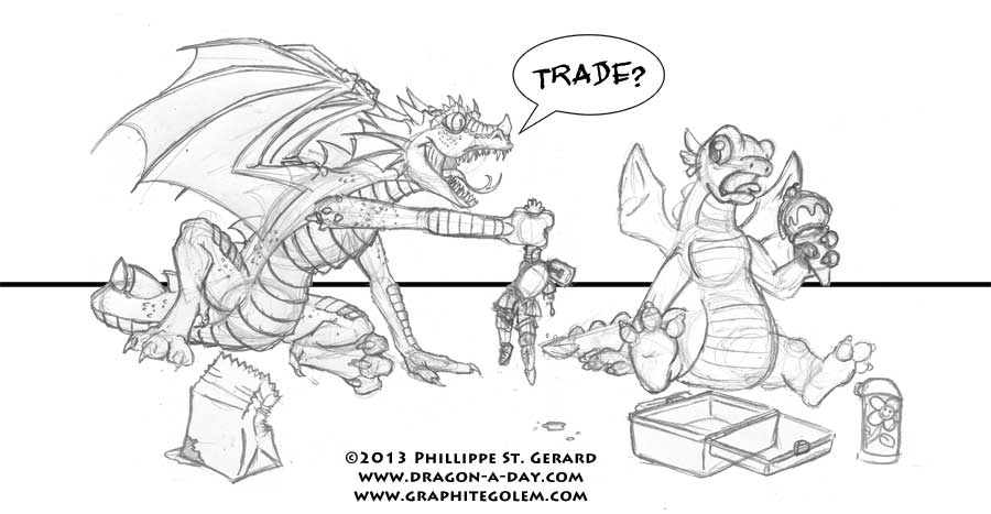
Adding some props also went a long way toward my peace of mind that the gag was a little more accessible- I was actually worried that the knight might not read as food to the uninitiated:

See? brown bags and lunchboxes… Don’t ask how she had an ice cream cone in there. (Click to enlarge.)
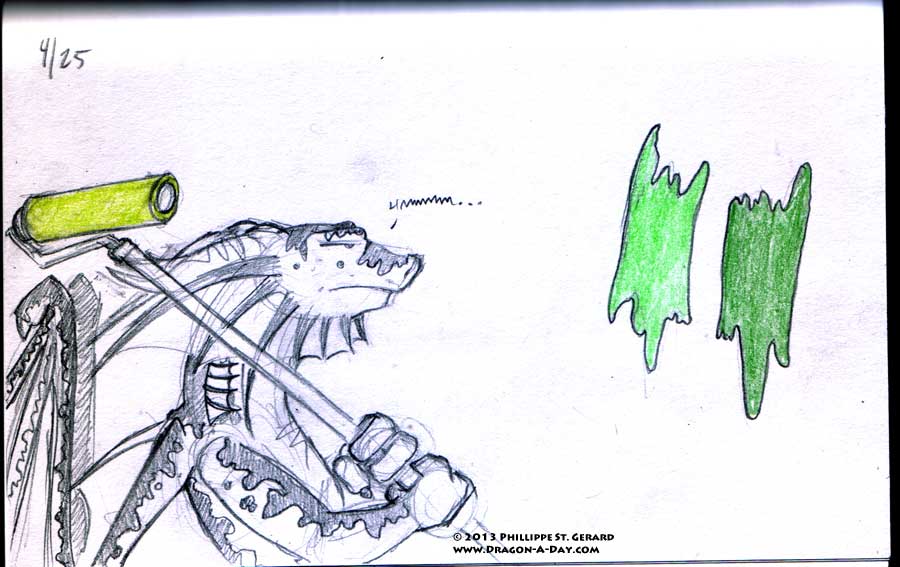
So now all that remains is to color it, which is a smaller ordeal, but still something of one. Mostly I am concerned about doing this image “right,” (hence the months of sketching and thinking), as I can’t help but shake the feeling that I’ve basically gambled a very large amount of money on advertising. Therefore, this image can’t just “sing,” it has to get up and dance, remind the viewer to tip their server, and then come back for an encore. So I’ve been looking at color schemes for half the day after I realized that I can’t just blunder through coloring things the way that I sometimes do- I need to exercise discernment.


