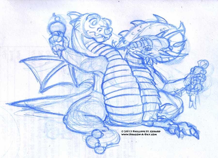
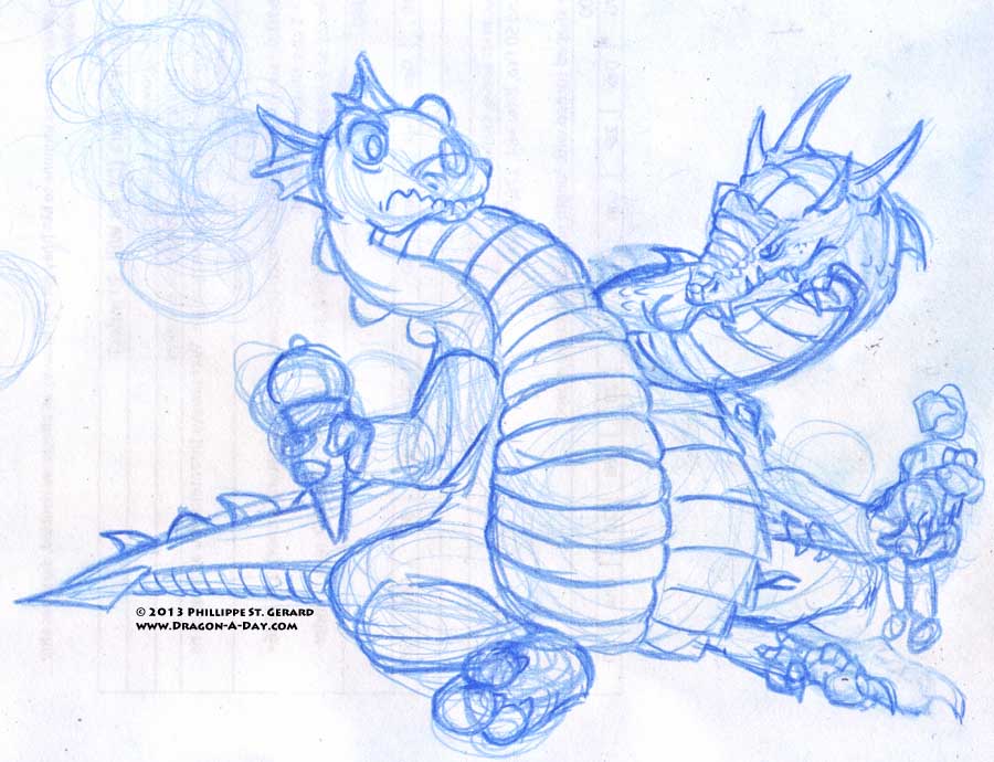
First, progress of a sort:
 I find that I like the difference in the seated leg more, though I’m not sure about the pose overall- they are definitely looking at what they’re supposed to be looking at, but I’m not sure if the pose is better than the previous one or not.
Anyhow, because spending half the day drawing dragons for work isn’t enough, it’s time for tonight’s sketch. I’ve been putting off that “my dragon from the ground up” idea, and I’m not 100% sure why, so here goes.
Starting from the top (of the dragon, not the description):
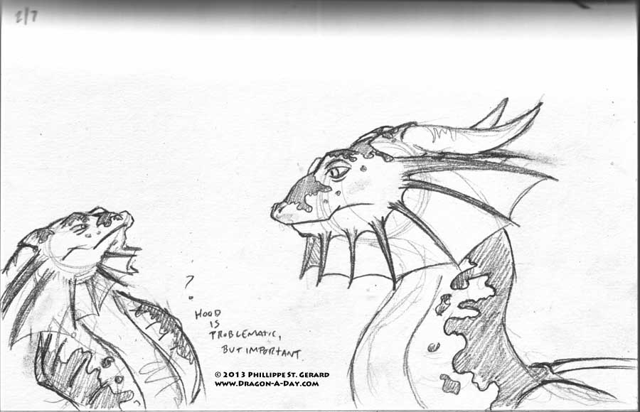
“… a hood like a cobra’s lies in the middle of the neck, extending or retracting with mood. Large fins adorn the sides of the head, and the dragon also has large, [slightly] recurved horns that run straight back. The fins run from the sides of the head to the chin, and get smaller as they do.”
Oddly enough, I didn’t mention the dragon’s blunt, almost squared-off snout, which is something of an anomaly amongst the slew of dragons I’ve come up with while working on this, so perhaps that is not as important of an identifying characteristic.
Oddly enough, I didn’t mention that the red “spatter” pattern didn’t extend to the face, so I let it. Also, after thinking about it, I’m not 100% sure what to do with the “hood;” I know it’s supposed to be there, but really, the neck is too short for it and the head fins (which I actually like a lot thicker and darker). I even went and looked up how cobra hoods work, to try and figure it out from a muscular/skeletal perspective, and I got nuthin’. I may just have to make the neck longer. The neck length in Part 0 is probably closer to what it would actually need to be like, and even that comes a wee bit too close to the head fins for my liking, but at least there’s room to play a bit.
I do kind of feel like I’m sticking a little too closely to the original, but I guess it’s got to resemble it at least a little, so I guess I’m allright.


