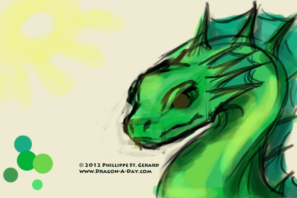
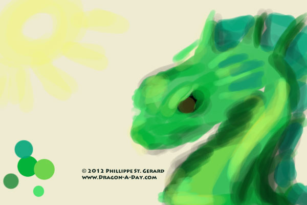
I was going to try picking up last week’s painting, but I really didn’t have the heart for it, as I’m in kind of a fey mood right now. So I got a bit experimental tonight, and oddly enough, I am strangely satisfied with the results:
It’s not as refined as I usually try to come up with, but lately I’ve been finding myself more and more enamored of digital painting that’s not quite as polished as it could be- the presence of brush strokes (even if they are all still a little too perfect) isn’t offputting to me. The highlights aren’t as sharp as they were in my head and the shadows are a little muddy (as they should be, since I made them with multiplied 80% black), but there was a point where I was looking at this and trying to figure out how to proceed in order to try and “clean” this up some that I decided that it was fine just as it was.
I had also considered taking away the lines and working from there, but again, it didn’t feel right. This isn’t a perfect piece of artwork, but I think that it’s a stepping stone in some direction.
For explanation’s sake (and possibly for my own future reference), here is how I did it:
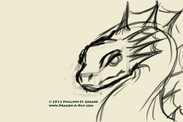
First, I did a line drawing.
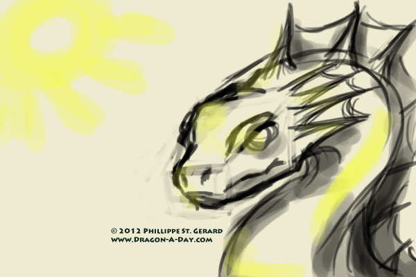
Then, I blocked out the areas of light and shadow (I’m still not really convinced that I did this right, but I did it) on a new layer, above the lineart:
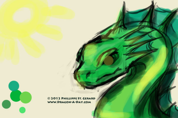
Next, I added a layer underneath the light/shadow layer but above the lineart layer, set it to Multiply, and dropped color in it:
At this point, I strongly considered hiding or severely lowering the opacity on the lineart layer, and just working with the color/shadow layers, possibly with the Smudge tool and/or sampling the colors and trying to smooth them out.
But, in the end, I dropped the light/shadow layer’s Opacity to 65% and left it alone, whcih resulted in the first image that you saw. That’s it.

